As a wedding planner, I like to think I'm pretty good at keeping my finger on the pulse when it comes to new wedding trends! Pantone announced the color of the year 2022 to be “Very Peri” – a stunning periwinkle shade. Immediately my head was spinning with ways to incorporate it into a wedding day (and flashbacks to where I had included it already!). Don't get me wrong, I never want anything to look “trendy” (that will just look dated in a few years), but I do like to follow what couples are gravitating towards – what's new and exciting. Who doesn't love to feel inspired?
If you have followed me for a while, you know I love incorporating color into my wedding day designs. It's not that I don't think a classic wedding color palette of white, blush, and greenery is pretty… but I wouldn't be mad if that stops being all we see for a while!
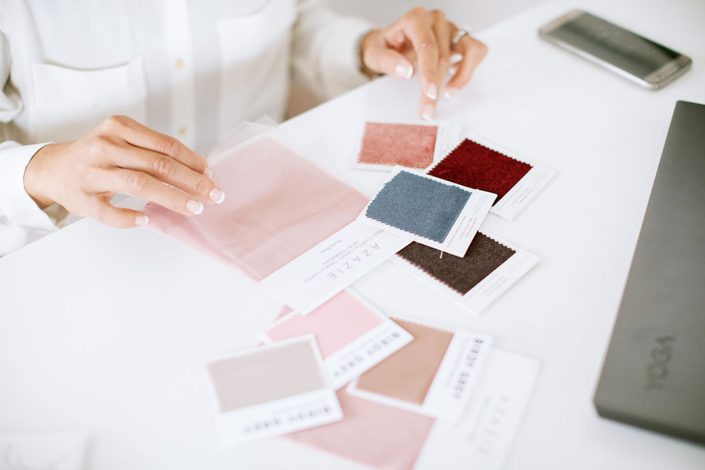
In case we haven't officially met yet, let me quickly introduce myself! I'm Desiree, lead wedding planner and designer here at Verve Event Co. I live for (and love) to plan luxury weddings and other heirloom occasions all over Upstate New York (the Finger Lakes, Hudson Valley, and beyond). Let me be very honest: For someone less experienced in design, Periwinkle can be a challenging color to incorporate as an accent. You can see it in your head, but when it comes to executing it, it doesn't quite look how you pictured. This is literally where I shine! If you have a vision, let me help bring it to life. If you are recently engaged, you can read more about ways to work together here. For your daily dose of wedding inspiration, make sure to follow me on Instagram.
Most of my couples don't like getting caught up in all the details (they just want to enjoy the fun parts!) but if you are more the DIY-type and want all the details when it comes to wedding planning, you can also listen to my “Ask the Planner” podcast here, or check my shop for wedding planning checklists and resources!
Now, let's skip to the good part: How to Incorporate the Pantone Color of the Year in 2022!
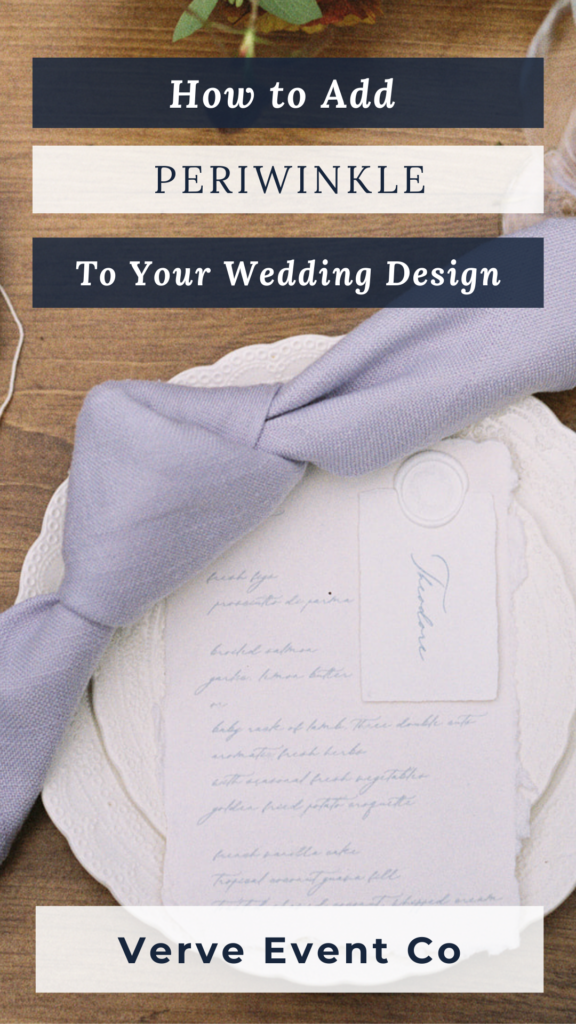
Wedding Attire: Bridesmaid Dresses, Accents & More
Periwinkle can be a gorgeous color for bridesmaid dresses. It has a beautiful soft, feminine feel but is balanced with a boldness from the richness of the color. This color would also be a stunning alternative dress for a rehearsal dinner or bridal shower to change it up. I mean, we all have seen white, ivory, blush, and cream! Don’t be afraid to be bold. It's your day! It's very possible this light hue could show up in wedding dresses as well (the new blush maybe?).
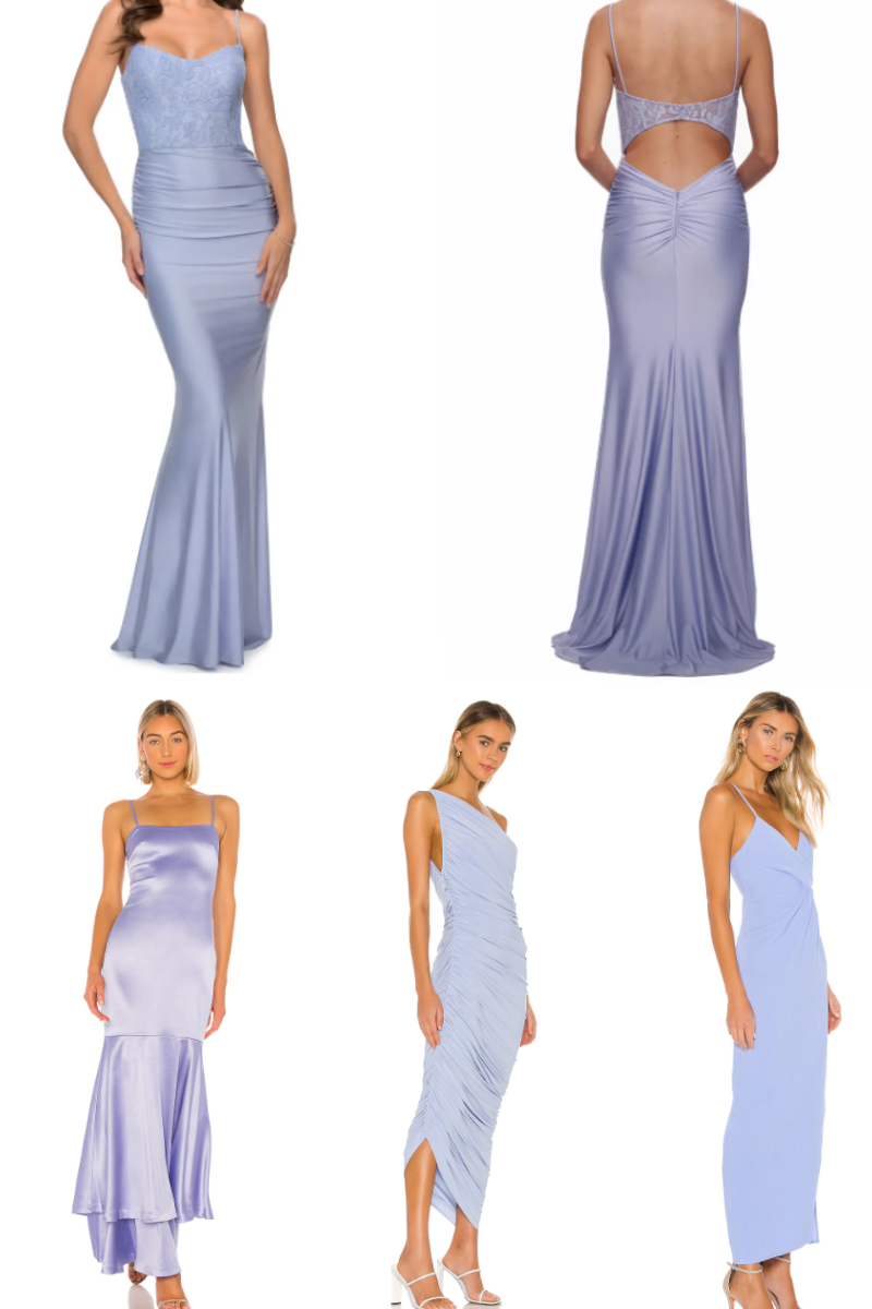
Shop the look: Top, Bottom left, Bottom center, Bottom left
And let's not forget about our groom(s)! I love a good bowtie and suspender set, but you can get really creative with ties as well! Don't feel limited to choosing a solid color either, Periwinkle lends itself really well to both classic patterns (like a paisley print!) or floral design.
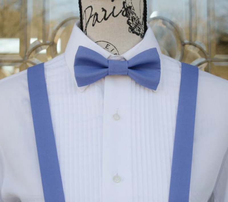
Shop the look: Above
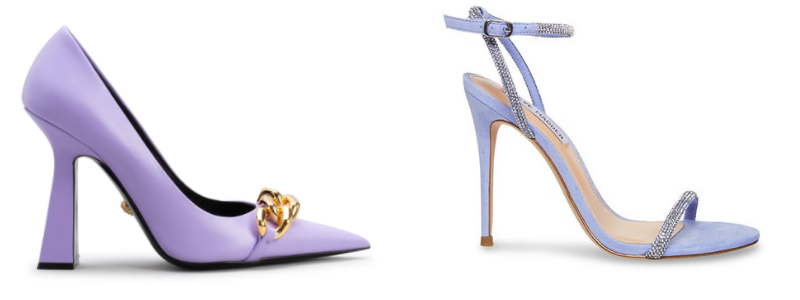
Let me just channel my inner Carrie Bradshaw for a second: let's never forget the shoes! If having a periwinkle dress feels too loud for you, try it out in your heels. Your shoes can be statement piece underneath your dress and can even offer that “something blue” factor if you lean more toward the light blue undertones. This is a beautiful way to subtly add a pop of color while still looking stunning and elegant.
Or, if you want a statement piece without being over the top, these David Yurman studs are beautiful. I personally love a fun and fresh take on a classic earring and these are definitely it!
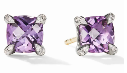
Shop the look here.
Using Pantone's Color of the Year 2022 In Stationery
Stationery, such as your save the dates, invitations, or place cards can be a playful way to incorporate periwinkle into your wedding design. Very Peri has such a natural and joyful attitude, making it the perfect selection for your special day. What better way to get your guests excited about the event they are invited to or the meal they are about to eat? This fun pop of color will make your stationery stand out from any traditional white or ivory stationery guests have seen before. The below stationery set was used in a stunning editorial shoot featuring last years color of the year for 2021: Illuminating Yellow (another joyful hue!).
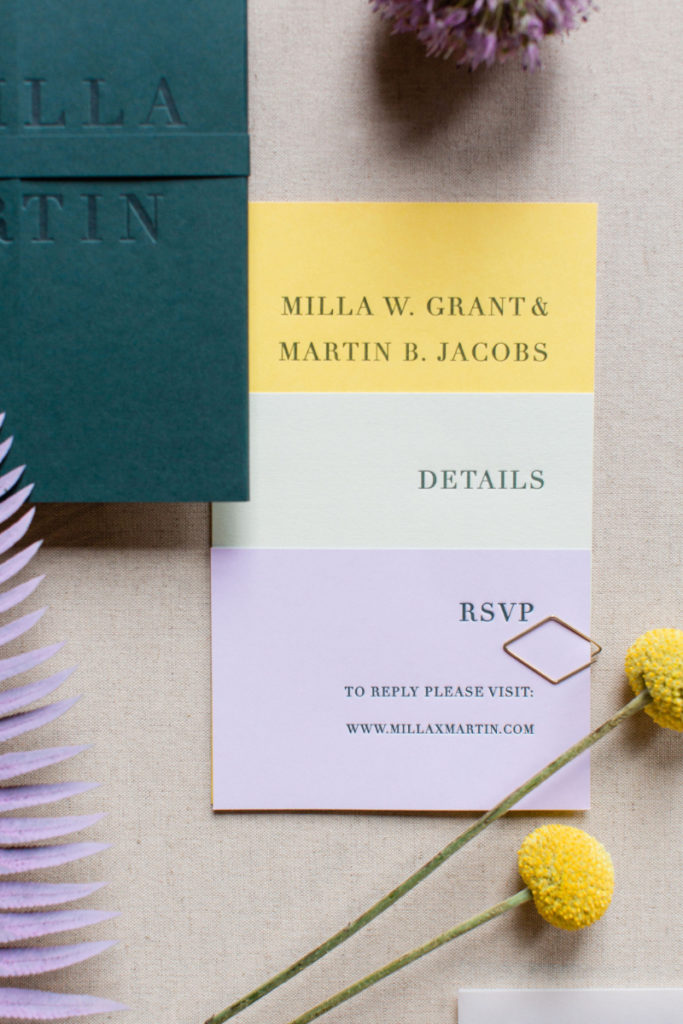
Photography: Laura Rose Weddings
Wedding Florals
Looking for a Very Peri wedding design? By including periwinkle touches in your wedding florals, your arrangements are bound to be beautiful. If you choose to make Periwinkle a statement wedding color, these soft florals are stunning paired with creamy white flowers. The softness of any white and greenery mixed with the subtle boldness of periwinkle will create a dreamy display.
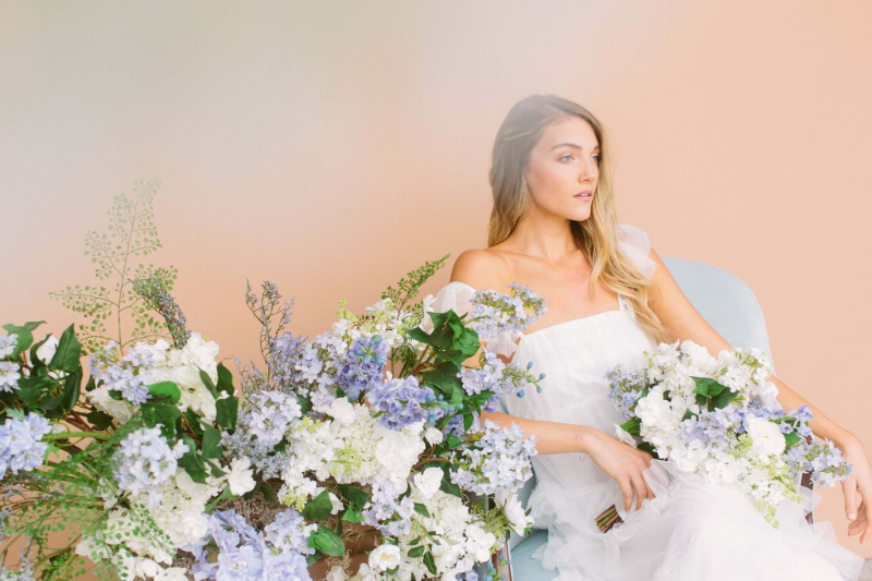 Photo Credit: Something Borrowed Blooms
As I was reflecting on the last year, I also thought about Caleb and Eddie's wedding florals. Although maybe not a true Periwinkle hue, it certainly provides a ton of spring wedding inspiration. You can peruse even more of their wedding day here.
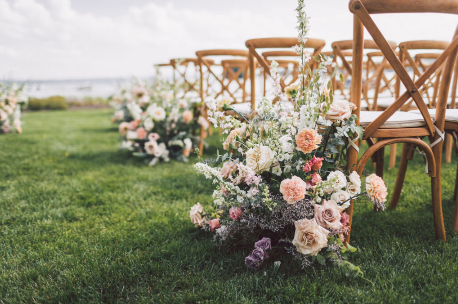
Photography: Larkin and Trevor Photography
Your Wedding Table Decor
Last but certainly not least, there are so many ways to incorporate Very Peri into your wedding table decor! After all, this is typically where your guests will spend more time than anywhere else on your wedding day (except, perhaps, the dance floor!). Incorporating different variations of periwinkle throughout the table setting lends itself to a modern style that can be done quite beautifully. Through candles, linens, florals or even macaroons (my personal fave!), periwinkle can add a fun pop to the room and change up the whole aesthetic. The color really does speak for it itself so less is more but when done right, it is simply stunning.
If you are looking for spring wedding inspiration, make sure to check out this dreamy Provence inspired editorial.
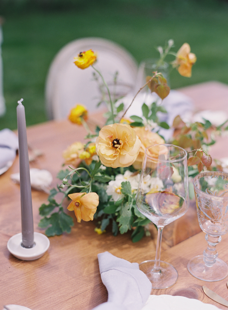
Photography: Moe B. Photography
Using Veri Peri – Pantone's Color of the Year 2022 – On Your Wedding Day
I hope this gives you just a few places to start when thinking about where to incorporate this soft yet rich hue into your wedding day! I personally was so happy to see Pantone choose such a stunning color for their color of the year in 2022, and I can't wait to see the ways it pops up in 2022 and 2023 weddings. Before I leave you, I know I mentioned this a little earlier, but I do want to stress that although stunning, this is NOT the “easiest” color to incorporate on your wedding day, so making sure you focus on the execution is absolutely crucial. I'm always going to recommend working with a professional wedding planner and designer to ensure flawless execution, but if you ARE going the DIY-route, make sure to grab a mood board template from my shop! Having something visual to keep your vision together is crucial when executing a flawless wedding design!
comments +